info copied from: typography online
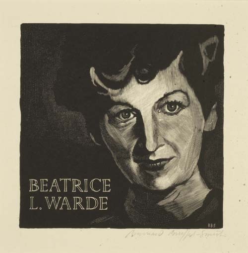
Beatrice Warde (1900-69). American typographer, writer and scholar who spent much of her working life in England. Educated at Barnard College, Columbia, where she developed an interest in calligraphy and letterforms. From 1921-25 Beatrice worked as assistant librarian with the American Type Founders Company, pursuing her research into typefaces and the history of printing. In 1925, after marrying the type designer Frederic Warde, she moved to Europe, subsequently working for the Fleuron, then edited by Stanley Morison.
Her reputation was established by a 1926 article in the Fleuron, written under the pseudonym of 'Paul Beaujon', which traced types mistakenly attributed to Garamond back to Jean Jannon of Sedan. In 1927 she became editor of The Monotype Recorder, London.
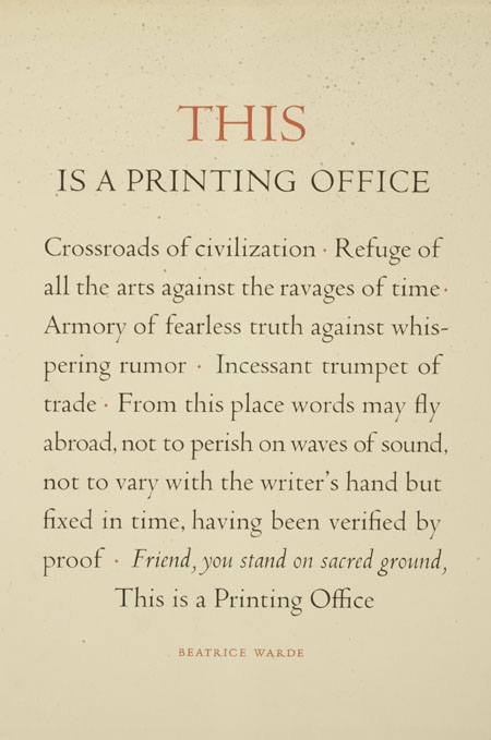
Beatrice Warde was a believer in the power of the printed word to defend freedom, Warde wrote and designed the famous Monotype broadsheet This is a printing office (1932), using Eric Gill's Perpetua typeface. Rejected the avant-garde in typography as introspective, believing that classical typography proved a 'clearly polished window' through which ideas could be communicated. The Crystal Goblet: Sixteen Essays on Typography (1955) is an anthology of her writings.
The Crystal Goblet by:Beatrice Warde
Imagine that you have before you a flagon of wine. You may choose your own favorite vintage for this imaginary demonstration, so that it be a deep shimmering crimson in color. You have two goblets before you. One is of solid gold, wrought in the most exquisite patterns. The other is of crystal-clear glass, thin as a bubble, and as transparent. Pour and drink; and according to your choice of goblet, I shall know whether or not you are a connoisseur of wine.
For if you have no feelings about wine one way or the other, you will want the sensation of drinking the stuff out of a vessel that may have cost thousands of pounds; but if you are a member of that vanishing tribe, the amateurs of fine vintages, you will choose the crystal, because everything about it is calculated to reveal rather than to hide the beautiful thing which it was meant to contain.
Bear with me in this long-winded and fragrant metaphor; for you will find that almost all the virtues of the perfect wine-glass have a parallel in typography. There is the long, thin stem that obviates fingerprints on the bowl. Why? Because no cloud must come between your eyes and the fiery hearth of the liquid. Are not the margins on book pages similarly meant to obviate the necessity of fingering the type-pages? Again: The glass is colorless or at the most only faintly tinged in the bowl, because the connoisseur judges wine partly by its color and is impatient of anything that alters it.
There are a thousand mannerisms in typography that are as impudent and arbitrary as putting port in tumblers of red or green glass! When a goblet has a base that looks too small for security, it does not matter how cleverly it is weighted; you feel nervous lest it should tip over. There are ways of setting lines of type which may work well enough, and yet keep the reader subconsciously worried by the fear of "doubling" lines, reading three words as one, and so forth.
Printing demands a humility of mind, for the lack of which many of the fine arts are even now floundering in self-conscious and maudlin experiments. There is nothing simple or dull in achieving the transparent page. Vulgar ostentation is twice as easy as discipline. When you realise that ugly typography never effaces itself, you will be able to capture beauty as the wise men capture happiness by aiming at something else.
The "stunt typographer" learns the fickleness of rich men who hate to read. Not for them are long breaths held over serif and kern, they will not appreciate your splitting of hair-spaces. Nobody (save the other craftsmen) will appreciate half your skill. But you may spend endless years of happy experiment in devising that crystalline goblet which is worthy to hold the vintage of the human mind.